Your energy bills show the cost. Your load profile helps explain it.
You want to know where your energy goes and which changes are worth pursuing. We relate your energy data to the equipment and day-to-day operation of your business.
We start with the information you already have. Together, we decide whether additional metering or monitoring would help you make better decisions.
Example analyses
Energy data. Technically explained.
Heat flows, storage, fleets and energy indicators reveal different aspects of an operation. These approved analyses are examples without client attribution. The technical assessment always reflects the individual project.
Waste heat · temperature levels
Matching heat sources and heat sinks
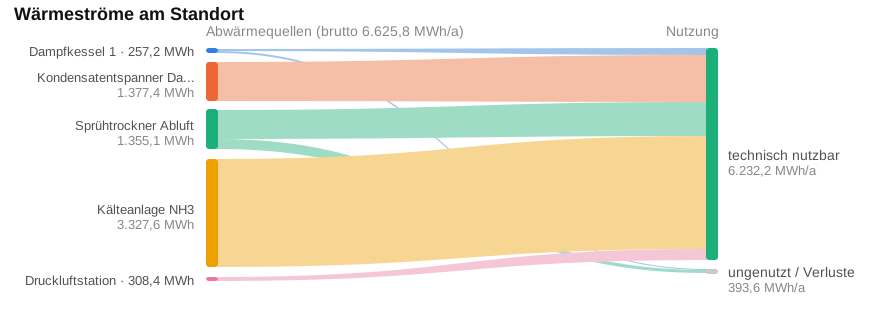
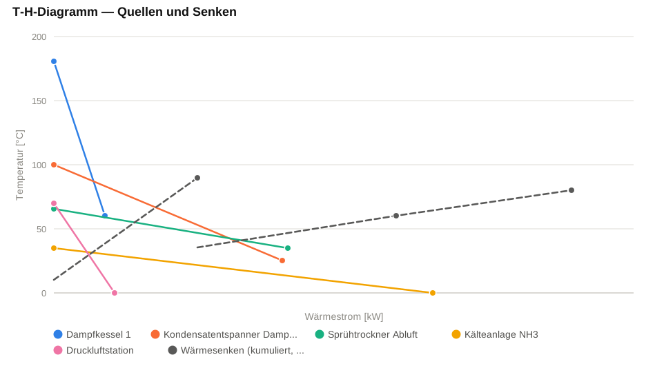
Temperature levels and heat flows show which waste-heat sources could match a heat demand. A practical solution also depends on operating times, transfer losses and the equipment required.
The widths of the flows represent annual heat quantities. The analysis distinguishes potentially usable waste heat from unused quantities and losses. Technical and economic feasibility need a separate project assessment.
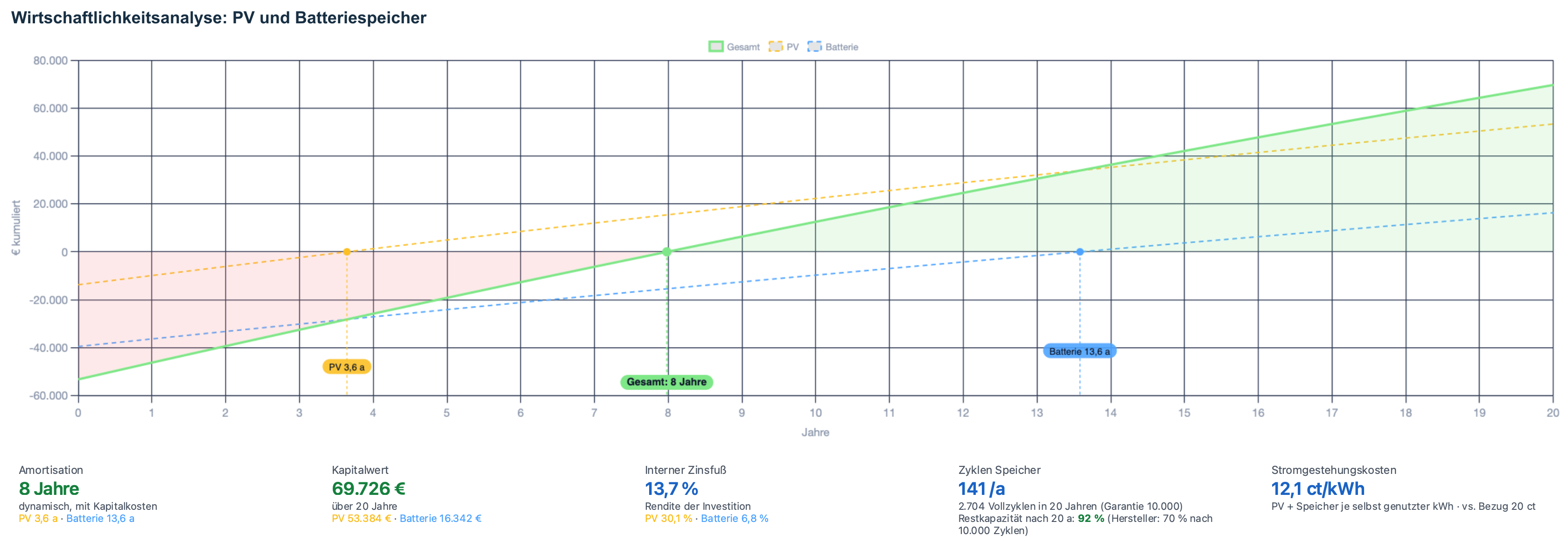
Discounted cash flows show when the investment is recovered in this scenario. Payback, net present value and internal rate of return complement the storage-cycle and electricity-cost indicators. The result depends on the assumptions used.
Vehicles are compared across both years. The moving bubbles show changes in annual distance, annual diesel consumption and energy input per 100 km. Select a year or pause the animation to compare individual vehicles.
2023
The transition illustrates the two annual states. Intermediate positions are not measurements. Vehicles only present in one year fade in or out.
Automatic motion is disabled by your device preference. Select a year to compare the two views.
Heat demand · weather and operation
Daily gas-energy signature
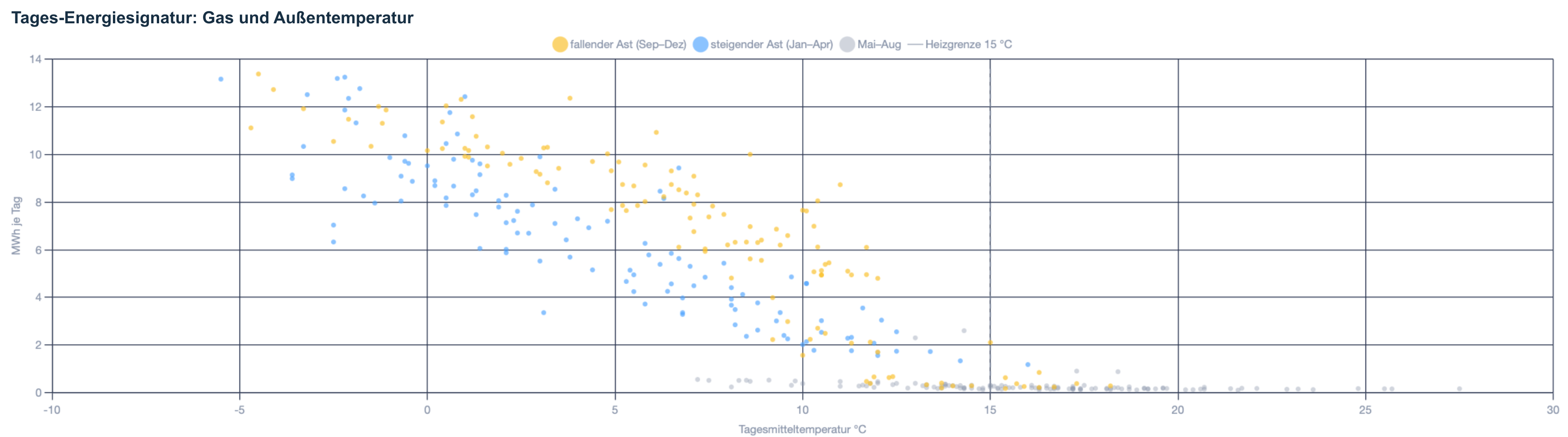
Each point relates one day's gas consumption to the daily mean temperature. Differences between autumn and spring indicate operating or other seasonal influences. The pattern helps identify questions for a closer technical assessment.
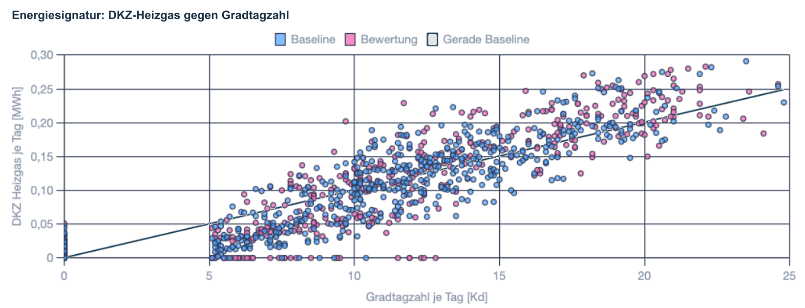
The baseline and assessment periods are compared with the heating-degree-day driver. The reference line helps identify changes at similar conditions. A conclusion about improved efficiency requires checking other relevant operating influences.
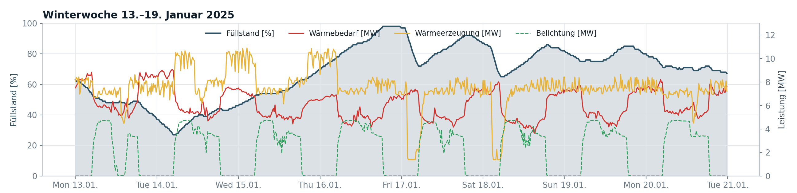
Storage fill level, heat demand and heat generation show how charging and discharging interact during the displayed January period. The separate lighting curve provides operating context. Fill level and thermal power use different axes.
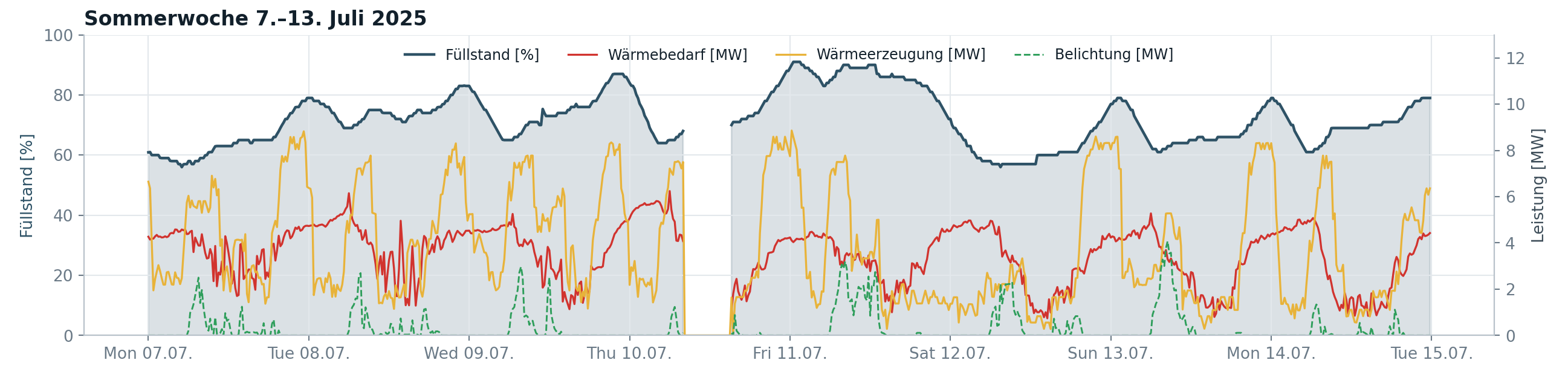
The displayed July period shows how storage operation changes with a lower and more variable heat demand. Read the fill level together with generation and demand. Compare patterns using the respective axis units.
Open the charts at full size to read the detail. For the fleet, select 2023 or 2025 or play the smooth comparison. The results are project-specific examples. Conclusions about savings and economics require an assessment of the relevant data and assumptions.
01
HCH Energy Solutions
Build the data foundation
You receive an overview of the energy data available in your business and what it can tell you.
02
HCH Energy Solutions
Connect consumption and operation
You understand when your business uses energy and where it is worth taking a closer look.
03
HCH Energy Solutions
Monitoring and reporting
You keep track of your energy use and can respond when costs or operating patterns change.
04
HCH Energy Solutions
Track measures effectively
You can see how implemented measures affect consumption and whether further adjustments are needed.
Energy data check
What would you like to understand about your energy use?

 Enlarge chart↗